Creative Inkscape effects in practice
The first article of this two-part series [2] introduced the effects toolkit of the leading free vector graphics program, Inkscape. In this article, I'll show how to create some real artworks based on these techniques.
Getting Started
You can start by creating a slightly oriental, shiny pattern (Figure 1, bottom right), which is quite easy to do in Inkscape. For the intricate pattern, you can use a photo from a Persian wall mosaic [3] (Figure 1, top left), which you can trace with Inkscape's vectorizing tool and create the image you see in Figure 1, top right.
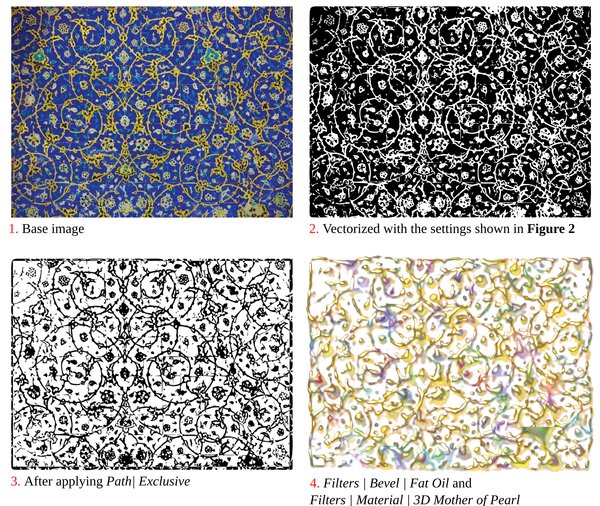 Figure 1: From an original photo (1), you can apply the settings shown in Figure 2 to create a vectorized version (2). Then, apply an exclusive-or function (3) and finish with "fat oil" and "mother-of-pearl" effects (4).
This image would end up having too many nodes to manipulate comfortably, so you should reduce it in advance to 1,000 pixels wide.
Peeling Away
The vectorization function Path | Trace Bitmap transforms the golden arabesque pattern in a few mouse clicks to a vector format (Figure 2). Recognizing shapes in photos is a challenge for computers, even if it is easy for humans. Nevertheless, with a proper use of Inkscape's vectorization tool, you can get very good results.
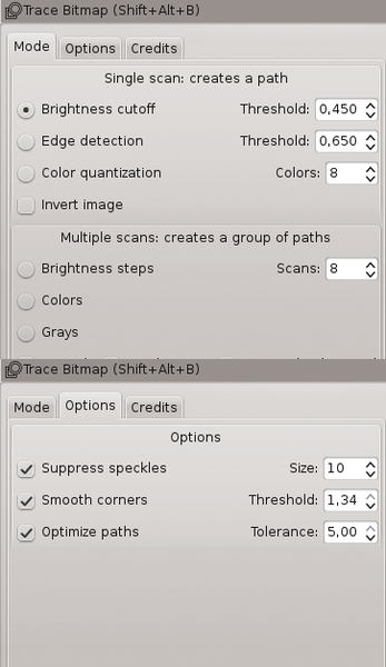 Figure 2: You can use the settings in Path | Trace Bitmap to vectorize the Persian wall mosaic.
Luckily, the original Persian wall mosaic photo, despite its delicacy, is easy to convert, because of the contrast between the blue background and yellow pattern. Therefore, you would not need the Edge detection algorithm (not selected in Figure 2) that finds the edges in images with many similarly colored elements.
The default tracing mode Brightness cutoff with a value of 0.45 is enough to detect the yellow mosaic elements. The turquoise-colored element is considered dark, but that actually works well to give the result (Figure 1, top right) an uncluttered look.
This kind of vectorization renders the image in black-and-white. The Inkscape handbook describes how to generate multicolored images [4].
The complexity of the paths created through vectorization presents one of the challenges of detecting bitmaps: The number of nodes can get so high that it can take Inkscape minutes to display them.
You can control this through the Options tab in Trace bitmap (Figure 2, bottom) by setting the Suppress speckles option for the specified Size , which you can set to 10 pixels, for example.
For Smooth corners and Optimize paths , you should choose the maximum values 1.34 and 5.00 , respectively, for the smoothest possible yet not too complex result.
Mother of Pearl
The vector transformation should then become a negative image for the final patterning that is to follow. You can check off Invert image on the Mode tab to turn it to positive again. Unfortunately, this step renders the image visually compact with a dark edges.
A better solution is to draw a filled rectangle that covers the pattern but leaves a small border. Then, use Path | Exclusion to invert the area covered by the rectangle, which leaves the narrow dark strip around the edges of the original negative.
The powerful Inkscape filter effects handle the rest. Filter Effects | Bevels | Fat Oil coats the flat, woodcut-like forms with a viscous oil layer to give it an almost 3D shading effect. Filter Effects | Materials | 3D mother of pearl adds an iridescent frosting to the pattern.
Letter Acrobatics
In elaborate graphic design applications, you can get text to flow on more than just straight lines. One approach to playing with text is found in the Inkscape function Text | Put on Path ; however, this tool is somewhat too reminiscent of the word-art function of word processing programs and is equally limiting. To shape text really creatively, you must convert it into vector shapes. Then, the rich palette of Inkscape path effects becomes available to satisfy your creative imagination (Figure 3).
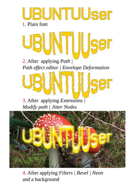 Figure 3: After converting text strings to vector elements, you can shape them according to your imagination.
You first convert the text to a vector form with Path | Object to Path , which puts the text into a set of paths to which, unfortunately, you can't apply any path effects. Therefore, you can divide up the group with Ctrl+U and recombine the individual text character objects into a single path with Ctrl+K.
You can then "knead" the path with Path | Path Effect Editor | Envelope Deformation . This tool makes the text-manipulation utilities of your typical word processors look downright primitive in comparison. With Envelope Deformation , you can stretch the four corner control points (nodes) into Bézier curves with the Node Tool (Figure 3, second diagram). You can manipulate these so-called envelope curves in the Path Effect Editor (see Figure 4).
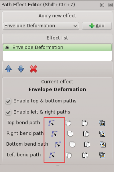 Figure 4: After clicking one of the four red nodes, you get an envelope curve path that can be formed like the usual vector path.
Despite the creative deformation of the whole object, the outlines of the text still look too smooth. To help with that, use Extensions | Modify Path | Jitter Nodes (Figure 3, third diagram).
First, you need to convert the object deformed with the Path Effects Editor tool to a static path again with Path | Object to Path . This action ends any "live" changes to the envelope curves, but you can first modify them exclusively with further live effects, although not with common extensions.
Jitter Nodes works only if you previously used Extensions | Modify Path | Add Nodes to add nodes to the object at regular intervals. For the slight irregularities seen in the diagram, set max. segment length to 15.0 pixel separation. Jitter Nodes with a Maximum shift of 1 in both directions. You can activate Shift nodes and Shift node handles to get the handmade effect in Figure 3, third diagram.
Blazing Words
If you add a Filter Effect to the text (in the example, Bevels | Neon ), the text is modified further (Figure 3, bottom diagram). You can then add a fiery bitmap background (Figure 5) in the next step.
 Figure 5: A transparency mask applies the fiery background to the text.
Here is where Inkscape's powerful masking function comes into play (Object | Mask | Set ). Whereas an edited path simply trims the background image, a mask brings the background image forward within the contours of the superimposed object bases the opacity on the lightness or darkness of the mask.
Dark parts of the mask yield a total transparency, while white parts remain opaque. Thus, you see the textured effect that the Dark glass filter adds to the Ubuntu User text in Figure 5. To do this, first import a fiery red bitmap into the Inkscape document. This image serves as the text background. Place the text over the background, select both, and use Object | Mask | Set . To have the text clearly visible (because the mask renders it semitransparent), you can also back it up with an effectless wine-red copy of the text.
Non-Identical Clone
The last example is based on the Inkscape tool Edit | Clone | Create Tiled Clones . By default, this tool generates a palette of simple evenly spaced objects (Figure 6, top).
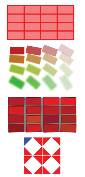 Figure 6: The tiled clone tool creates multiple objects and varies many clone properties.
However, you can vary many Inkscape parameters as desired, such as shift, color, scale, rotation, blur, and sharpness progressively in x and y directions (Figure 6, second diagram). The changes can be linear or exponential and even random (Figure 6, third diagram).
You can use the clone function to rotate and mirror the objects with every cloning step (Figure 6, bottom). As Wikipedia clearly explains [5], the tool offers 17 possible ways to create repeating patterns through transformation, rotation, and mirroring. Inkscape uses all these symmetry methods, and they can accessed from the Symmetry tab in the toolbox dialog.
Cloning even works for backgrounds. Figure 7 shows a grid effect based on the brightness of a stored bitmap. Horizontal and vertical color and saturation changes in the small squares add a little color to the black-and-white photo.
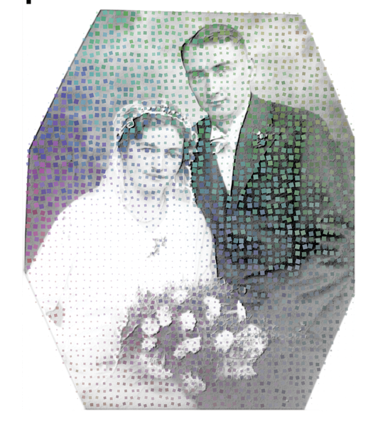 Figure 7: Because the tiled clone tool responds to the brightness curve of the bitmap, you can create many visually interesting grid effects.
The random generator rotates the objects at a maximum 10 percent and varies their intervals up to 20 percent so that the distribution is less uniform and looks more handmade. The opacity and size of the squares are determined by the brightness in the photo.
Point by Point
The speckled photo measures 725x875 pixels. A square of 7x7 pixels at the upper left of the photo serves as the basis for the grid in Figure 7. The clone tool can change the color only if both the color and fill are unset by choosing the question mark on the Object | Fill and Stroke dialog (Figure 8).
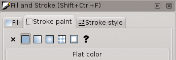 Figure 8: To make the tiled clone tool change colors, the base object needs to have a fill and stroke of unset.
Next, open the Edit | Clone | Create Tiled Clones dialog while the little square is still active. On the Symmetry tab of the Create Tiled Clones tool, choose Simple translation without any rotation or mirroring.
To set the correct density for the grid, on the Shift tab, set the Shift X value to 100 percent per column; then, set the same value for the Shift Y , plus a Randomize factor of 20 percent in both cases (see Figure 9).
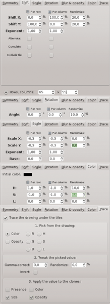 Figure 9: The settings on the Create Tiled Clones dialog create the colored grid in Figure 7 based on the little square in the top left corner of the photo.
When you set the Rows, columns at the bottom of the dialog to 65 and 55, respectively, and then click Create , a slightly irregular pattern emerges that completely covers the bitmap.
To add a bit more variety, on the Rotation tab, you can enter a value of 100 percent for the Angle and 10 percent for Randomize .
On the Scale tab, then choose Scale X and Scale Y values of -0.3 per row and column so that the splash of color shrinks slightly toward the lower right margin.
Color Splash
On the Color tab, click the little field next to Initial color and add a turquoise shade. In Figure 7, you see that this step varies the base color, with the H ("hue") set to 1 percent per row and -1 percent for column, plus a randomize factor of 10 percent.
The S ("saturation") is reduced by -1 percent for every row and column in the example. When you click Create at this point, you will get a colored grid that is placed over the bitmap, similar to what you can see in Figure 7. However, the size of the grid points still doesn't match the brightness of the photo.
To do this, go to the Trace tab and enable the Trace the drawing under the titles option. With the 1. Pick from the drawing option enabled, leave this as Color to set it as the criteria for the size of the grid points. On a black-and-white image, the L ("luminance") setting would have the same effect as described previously.
Under 2. Tweak the picked value , using a Gamma-correct value of 3 would create a well-scaled brightness effect on the grid. Under 3. Apply the value to the clones , the Size and Opacity selections provide a realistic grid effect.
The tiled clone tool can also theoretically be used for four-color printing grids. This example, which varies the image brightness by position and uses random values, still doesn't ensure correct color reproduction.
Additionally, the turquoise and purple tones enrich the black-and-white image with a few selected splashes of color, which is at least pleasing to the eye.
More to Come
In this article, I described several Inkscape features, such as filters, transparent masks, envelope curve deformation, and the jitter node extension along with the tiled clone tool. These are definitely important Inkscape functions that have creative potential, but I have really just scratched the surface of this powerful application.
Another definite advantage of the Inkscape SVG editor is that all three examples presented here, after being saved in normal SVG format, can be opened in modern web browsers without compromising their resolutions or the effects.
Infos
- Inkscape handbook: http://tavmjong.free.fr/INKSCAPE/MANUAL/html/index.php
- "Inking It In" by Peter Kreussel, Ubuntu User, Issue 20, pg. 58.
- Persian wall mosaic: http://www.xc.hu/photo/465513
- Tracing bitmaps: http://tavmjong.free.fr/INKSCAPE/MANUAL/html/Trace.html
- Symmetry schemes: http://en.wikipedia.org/wiki/Wallpaper_group