Pretty Pages
A document's design can make a lasting impression. We provide some tips to achieve a pleasing combination of fonts, color, and spacing.
A document's design can make a lasting impression. We provide some tips to achieve a pleasing combination of fonts, color, and spacing.
The fact that fonts define the look of a document is obvious. What may be less known is that fonts determine the structure as well. In fact, almost every important part of the layout is determined by your choice of fonts. That may seem like an exaggeration, but it is true all the same.
A document's selection of fonts determines the line spacing in the document, and line spacing is the main factor in a page's color or the darkness of the text. Once you have the page color, the line spacing that provides it becomes the magic number for setting up the rest of a document's structure.
However, before you can make such decisions, you need to know more about fonts in general, including where to get them, how they are classified, and how they work in LibreOffice in particular.
Many users never venture beyond the fonts already installed on their computers when they design documents. Nothing is wrong with that choice, but nothing is particularly right with it, either.
By using fonts that everyone has seen many times, you greatly increase the chance of creating an impression of blandness. Popular fonts like Times Roman, Arial, or Helvetica can work against you, because they are so familiar that they encourage readers to pay less attention.
Traditionally, additional computer fonts are designed for sale like any other software. Design houses like Adobe sell hundreds, including the official versions of well-known ones like Avenir and Gill Sans.
For years, the only alternative to paying for fonts was to use free or public domain fonts, many of which have a well-deserved reputation for low quality. However, in the past decade, many free-licensed fonts have become available. You can find hundreds of free fonts at Google Fonts [1] or the Open Font Library [2].
LibreOffice supports Postscript (.pfb), TrueType (.ttf), and OpenType (.otf) font file formats. Other font formats exist and are often still supported by Linux distributions, but these formats may be limited in selection and quality and are best avoided.
You can install additional fonts through your operating system or place them in the /share/fonts folder in the system path listed at Tools | Options | Path to install them only for LibreOffice or OpenOffice. Usually, installing fonts for the entire system is the most convenient, assuming that you have administration privileges.
Fonts are set on the Font tab of a paragraph or character style (Figure 1). On the Font tab, each font has three basic characteristics: its family (known outside LibreOffice as the typeface), style , and size . Fonts can be further modified by features on the Font Effect tab, where formatting features such as the font color are set.
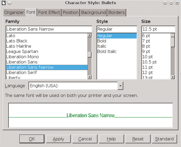 Figure 1: The Font tab of character and paragraph styles has the tools for working with fonts.
Fonts can be classified in several ways, but the most common are by design characteristics. The main categories are:
 Figure 2: Serif fonts have hooks at the end of letter strokes.
 Figure 3: Modern-looking sans serif fonts lack the hooks at the end of letter strokes that characterize serif fonts.
 Figure 4: In a monospaced font, each letter is the same width.
Other categories include Decorative, Script, and Dingbats, but none are common in text-heavy documents.
Different members of a font family are often called weights. This term refers to the thickness of the lines that make up the individual letters. In character and paragraph styles, LibreOffice refers to a weight as a font style .
Using the term "font styles" makes sense, because weights are not always defined by thickness of line. An italic weight, for example, is defined by the text being both angled to the right and rounded. The most common font styles include the following:
 Figure 5: Roman font styles are the standard fonts.
 Figure 6: Italic fonts are rounded and angled to the right. Oblique fonts are simply angled.
 Figure 7: Bold font styles have heavy letter strokes.
Another way to classify fonts has become popular thanks to the use of CSS style sheets on web page (Table 1).
Table 1
CSS Font Classifications
| Numeric | Descriptive |
|---|---|
| 100 | Extra Light |
| 200 | Light |
| 300 | Book |
| 400 | Regular, Roman |
| 500 | Medium |
| 600 | Semi-Bold/Demi-bold |
| 700 | Bold |
| 800 | Heavy, Extra, Black |
| 900 | Ultra, Extra |
Traditionally, fonts are measured in points. In the digital age, this measurement has been standardized as one-seventy-second of an inch or 2.5 centimeters. Previously, a point was actually slightly less, but it remains defiantly non-metric and a sign of typographic expertise.
When working with fonts, you should set LibreOffice's default measurement unit to points from Tools | Options | LibreOffice Writer | General | Settings . Using points will make the design process much easier. You can always change the Measurement unit back to centimeters or inches when you start to add content.
The font size refers to the amount of space given to each character and the empty space around it. However, how each font uses the empty space can vary tremendously. Each font uses a different amount of empty space, which explains why the actual height of fonts of the same size is inconsistent. In fact, the actual height can vary considerably (Figure 8).
 Figure 8: Fonts size refers to the amount of space given to each letter. Because some fonts use different amounts of white space, they can look bigger or smaller than fonts of the same size.
The standard size for body text is usually 10-14 points. Text for captions and notes sometimes goes as low as 8 points, whereas headings and titles are rarely more than 28 points. If a font has a lot of white space around it, you might want to use it at a slightly larger size sometimes to compensate.
Choosing a font begins with understanding the impression you want to make. For example, a commonly used font helps put readers in an accepting mood, whereas an unusual one might reinforce an impression of innovation.
At times, a font might need to fit the constraints of the page. A tall, narrow page, for example, might be matched with a similarly tall and narrow font. Or maybe a font has some association with the content – for example, at least one edition of Arthur Conan Doyle's The Hound of the Baskervilles was printed in Baskerville font.
The main purpose of the body text is that it must be easily readable by your audience in the conditions in which they are likely to see it. For example, if you are designing a memo template for a low-resolution fax, you might prefer a larger, bold text style. Similarly, a brochure aimed at seniors might use a larger font size than usual. In other cases, you may be limited by a lower printer resolution or even a temporary shortage of toner to fonts with thick, consistent lines.
Often, a key feature for body text is the x-height . This is just what it sounds like: the height of the lower case letter x , as well as lowercase letters such as r and m . As a rule, the higher the x-height, the more readable a font is likely to be.
The heading font is used for anything that guides readers through the document, but is not actually content. It is used most obviously by the Headings 1-10 styles in Writer . It can belong to the same font family as the body text, but, if so, it should be a different font style, size, or color.
Body and heading fonts should be compatible, but different enough so that one cannot be mistaken for another. In most cases, you need only these two fonts; however, this is not as limiting as it sounds. Most fonts include at least four font styles – Roman, Italic, Bold, and Bold Italic. Some have as many as nine, and a few have even more. Using too many font styles in the same document can look just as cluttered as too many different fonts, but you can generally use several font styles together without distracting from the document's content.
Matching fonts is an art form rather than a science, but you can increase the odds of finding fonts that go together by selecting ones that:
The only way to be sure that fonts match, however, is to experiment with them, both on-screen and by printing frequent hard copy samples.
More general considerations in font selection can include:
After you've chosen the fonts, you can turn your attention to the body font and page color it creates.
The page color in this context does not refer to whether the text is black or green, but to how dark or light a page looks. As you can see by opening professionally published books, you want the body text to be neither too black or too washed out, but a consistent dark gray. Anything else is likely to make the document harder to read (Figures 9-11).
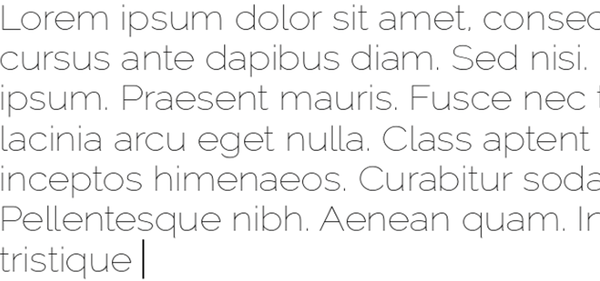 Figure 9: Too light a page color (using Raleway Light font).
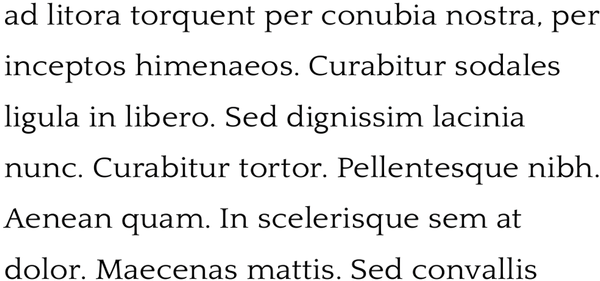 Figure 10: Too dark a page color (Quattrocentro Roman).
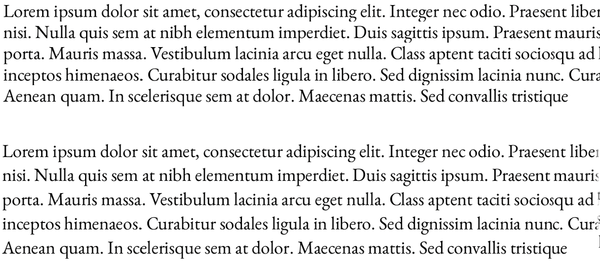 Figure 11: A suitable page color (E.B. Garamond).
By contrast, the color of headings is usually darker than the body text, so it stands out and is useful when readers are browsing. For the most part, you can ignore the color of headings and concentrate on getting the right color for the body text.
The single most important influence on color is line spacing. Line spacing is defined as the measurement from one baseline (the imaginary line that the bottom of a letter like n or m sits on) to the next one (Figure 12). In LibreOffice, line spacing is set in the Line Spacing field on the Indents & Spacing tab for paragraphs (Figure 13).
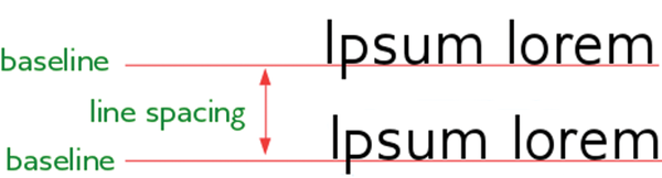 Figure 12: The baseline is the imaginary line that letters sit upon. The space between two baselines is called the line spacing.
 Figure 13: Set spacing to Fixed to adjust line spacing and to change page color.
In LibreOffice Writer, line spacing is averaged according to the font size. The exact measurement is displayed when you set the Line Spacing field to Fixed . LibreOffice sets a default line spacing based on the font size. For a 12-point font, that average is 14 points. However, because each font uses the space for characters differently, the default line spacing is not always ideal and may need to be adjusted by changing either the line spacing or the font size.
In theory or desperation, you can also use Position | Scale width to alter the width of the font's letters, or Position | Spacing to adjust the space between letters. However, in both these fields, small changes can have large effects on the appearance of a font. You need patience to use either field, and you may simply decide that any font that needs this careful attention should be discarded for another choice.
Developing an eye for line spacing and page color takes practice, so you might want to begin by comparing your efforts to a published book that is pleasing to your eye. However, certain contexts are more likely to need adjustments in line spacing than others, as shown in Table 2.
Table 2
When to Increase or Decrease Line Spacing
| Increase | Decrease |
|---|---|
| Fonts whose characters are narrow or have smaller spaces between them. | Fonts whose characters are broad or relatively large spaces between them. |
| A line of text less than 45 characters. | A line of text greater than about 80 characters. |
| Font sizes of less than 10 points, or more than 14. | Fonts of 10-14 points. |
| Roman fonts that are too black. | Regular fonts that are light gray. |
| Most sans-serif fonts; italic or oblique fonts. | Some serif fonts. |
If you think that page color needs adjusting, experiment with dummy text of at least three lines, so that you can concentrate on the page color rather than the contents. Often, dummy text is in a foreign language, which is why the fractured Latin that begins with "Lorem ipsum…" is often used. You can download copies of the Lorem Ipsum, as it is called, ranging from a few lines to several pages with a quick Internet search.
Copy the dummy text several times on the same page. First, apply each possible choice for your body text to a copy and compare the results. The chances are no better than 50 percent that LibreOffice's default line spacing will be ideal for a given font, so the next step is to make several copies of the dummy text that use your possible font, each with a different line spacing. Introduce changes in letter width or letter spacing only as a last resort.
Make small but systematic changes, comparing them frequently, until you have a page color that satisfies you. Adjusting page color is as much an art as a science, but viewing your samples both online and on paper and, from up close and from about 150 centimeters away, and consulting friends can all help you develop a sense of what works. Sometimes, too, economics enters the choice: Few hard copy publishers are likely to agree to 18-point line spacing for a 12-point font, no matter how aesthetic the results, because the extra pages it requires would seriously add to the cost of paper.
The Fixed line spacing – with or without letter width or letter spacing – that gives you a satisfactory page color is the magic number that will determine most of the rest of your design. Typographers designate a layout with the font size followed by the line spacing, so that a paragraph designated as 11/14 has a font size of 11 points and a line spacing of 14.
Beginning typographers often wonder how to proportion documents. Over the years, countless theories have evolved, many of them are uncomfortably elaborate. But the easiest is what I call – for want of a better name – the magic number.
The magic number is the line spacing that gives the best page color for the chosen Body Text font and all the paragraph styles based on it. The magic number's application is simple: Whenever possible, any measurement in a document will be a multiple of the selected line spacing. For example, if the magic number is 15, the indentation at the start of a new paragraph would also be 15 points. Similarly, the top page margin might be 60 points (4x15).
Not every design element can use the magic number, but most of the important ones can, as follows:
At times, you might use half the line spacing instead of a whole multiple. In theory, you could use a quarter of the line spacing or less. However, if you stop at half, then your document will never be far out of sync. Using the magic number is painstaking – but it is precise and unambiguous. You should have no trouble detecting a document designed with the magic number, because of its unified dimensions.
If all this sounds like a lot of work – it is. Although modern computer users take fonts for granted, the tradition of how to use them has developed over more than five centuries. Many printers and publishers consider the selection and arrangement of fonts a minor art form, and well worth taking pains over. The advantage of using the magic number is that it adds a uniformity of design and reduces many design choices to a system.
After all, if you place your thoughts in a pleasing form, the layout just might help to persuade your readers to your point of view – and think better of you as well.
The rumor is that the developers at StarDivision, which became OpenOffice.org, were told that would have to use the code they wrote to document it, so they put all the features they would need into it. That may or may not be true, but free software is especially fortunate in LibreOffice and its predecessor OpenOffice.org in having a document processor that allows high standards of design.
Infos